This morning, we highlight a few of the more interesting studies from the StockTwits Charts Stream.
1. You Can’t Paint to the Sky
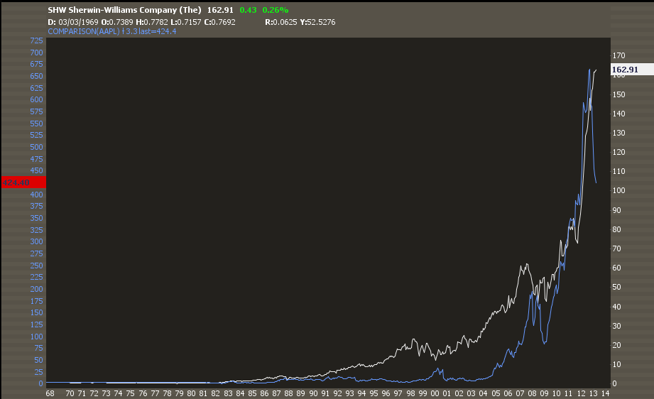
Over the past several months, chartists have compared most everything in the universe to Apple ($AAPL) as its fall from grace has been spectactular and impossible to ignore. From Kimble superimposing the $AAPL chart with the Eiffel Tower back in November and closer to the beginning of the slide to more recent comparisons with the Gold Miners Index ($GDX) which is also getting shellacked.
Most recently, @Ryknow compared the $AAPL chart with Sherwin Williams ($SHW).
This one is interesting though, not for what it implies about $AAPL but because of what it implies about $SHW. It has been a hell of a run for the paint maker, a proxy for the recovering housing market, but as the slope of the rise increases towards parabolic levels, something must give.
2. Copper and the SP 500
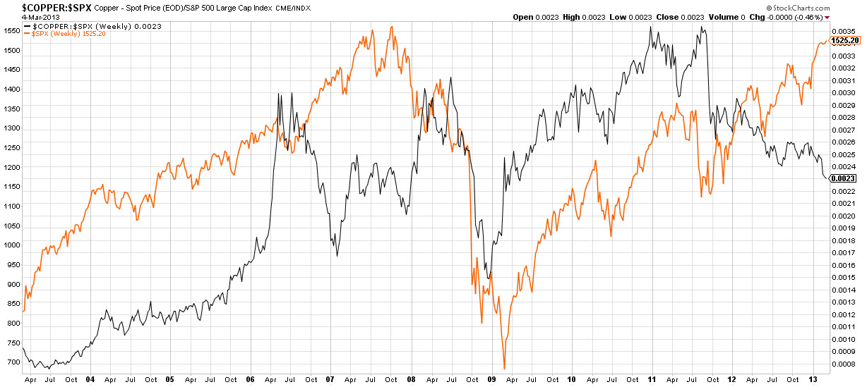
Last week, I showed a copper chart and noted how the metal continues to act poorly even as the US equity indices approach all time highs.
Darren Miller (@psychtrader) posts an excellent comparison chart of the Sp 500 ($SPX) and Copper ($JJC) noting the divergence between the two.
Darren compares the current divergence with that of a similar one in 2006-2007. It should be noted from the comparison that the divergence can last quite a while and that the ’07 one resolved with a strong move to the downside for both.
3. Employing Value and Price
Despite much bickering between the schools, fundamental analysis and technical analysis can be employed in conjunction by investors who get the importance of each and plan well.
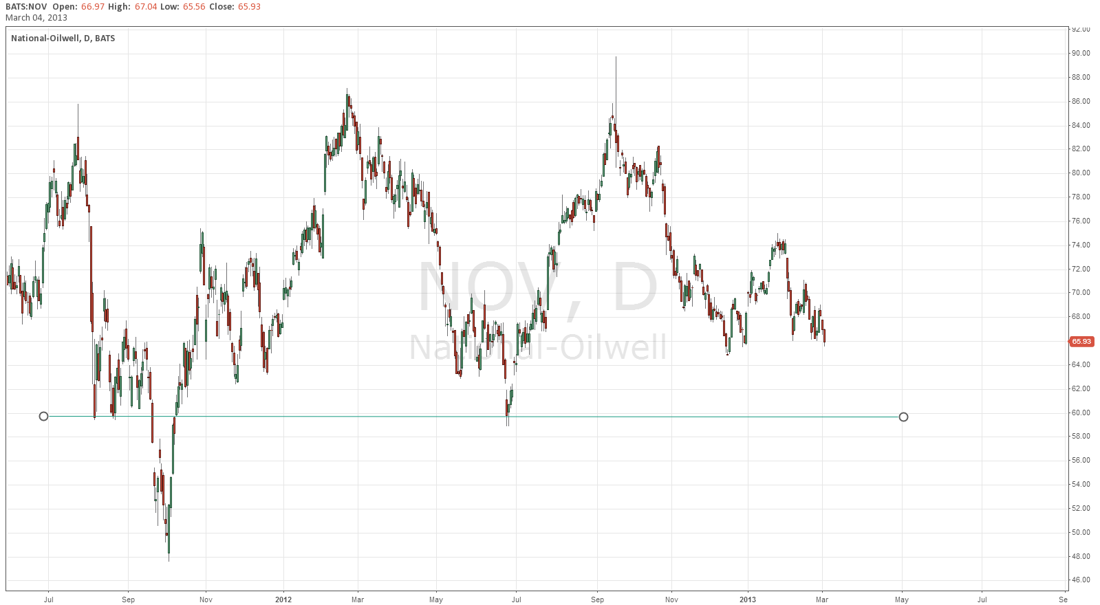
@Vlad_ggfinances does just that. He has been waiting to buy National Oil Varco ($NOV) based on value. Still, he uses technicals to help him determine an entry beforehand and to ensure that he gets the price he wants. He writes, “As soon as it gets to 60 I am buying been waiting for this.”
Love this patience, discipline and attention to price as value!


Leave a Reply