Friday marked an end of week and quarter and the action was very negative.
Below are a few key charts I plucked from the Chartly stream for your insight and pleasure.
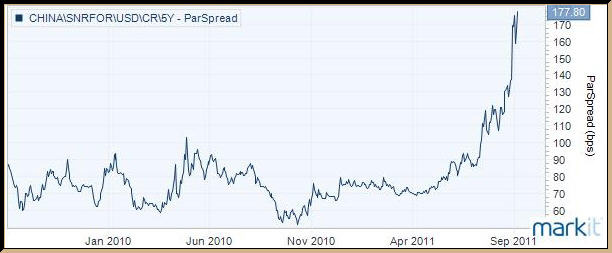
@hertcapital snapped this shot of China 5yr CDS chart which prices insurance of defaulting credit. Anyone who recalls the US credit crisis of 2008 is shuttering a bit looking at this one:
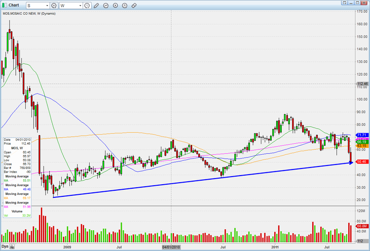
@HCPG posted this $MOS chart just before 2pm yesterday and it was so timely. It shows the weekly trend line dating back to 2009 which was indeed compromised by the end of day. May God help the ags…
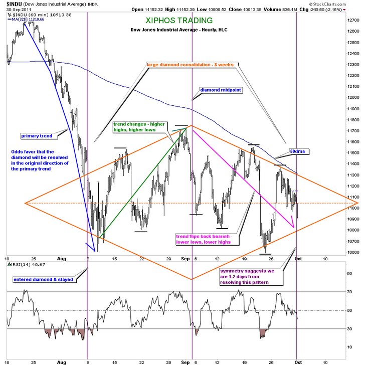
@Xiphos_Trading posted what I think is the key chart of the week here of the $DJIA ($DIA). Click through, expand it and take a close look at his notes. When an index is consolidating a most important question becomes one of timing. The implication of this diamond pattern chalk up is that resolution is getting near.
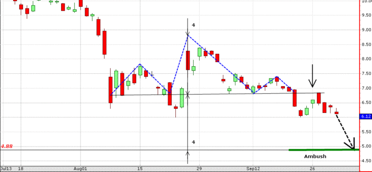
@NatanSI outlines a bearish head and shoulders on $BAC and captions it simply with “The story of my dreams.” Funny but ominous…
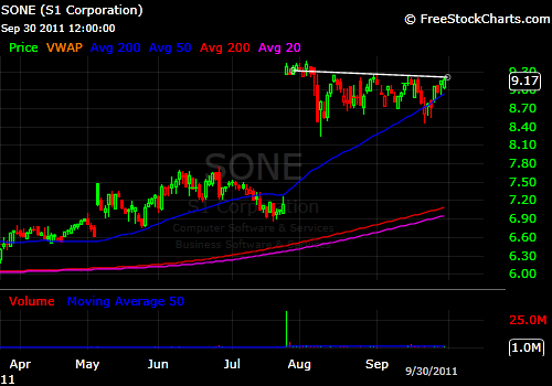
@ABtrader managed to find a few stocks holding up well in the melt down. $SONE somehow closed higher yesterday and looks poised.
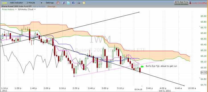
Finally, I must point to the work that @Fibline did yesterday on his Chartly stream. It was a work of art. He posted 10 charts of the $IWM starting before noon, chronicling his bearish view and the melt down BEFORE it happened.
Here’s one entitled simply “I smell Napalm here.”
Standing ovation bro!
Check out Fib’s full Chartly stream here.
Leave a Reply