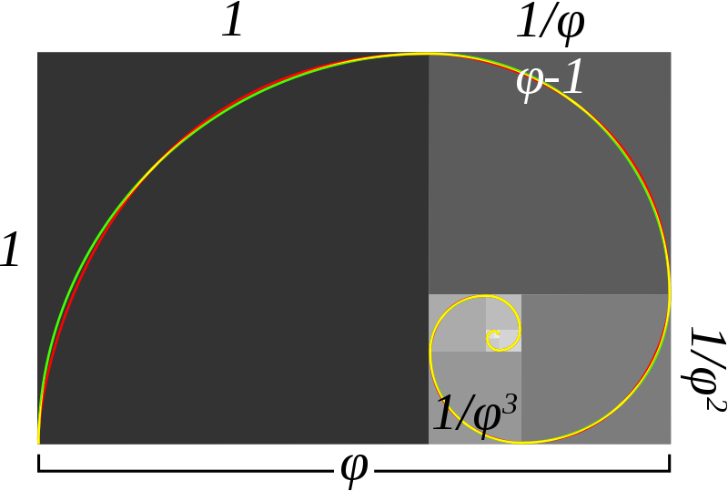
This video below filmed by @newsagg is a wonderful analysis of Fibonacci ratios drawn on a 20 year chart of the SP500 ($SPX, $SPY).
The confluence of the 61.8% line drawn from the early 90s bottom to the 2000 top and the 50% line drawn from the 2000 top to the 2008 bottom is remarkable.
We are presently bouncing about this line so the historical price context is key. The naturalist assumption is that its a pretty important level. Well done @newsagg!
Leave a Reply