I had the great pleasure of sitting down recently with the awesome Jason Voss at the CFA Institute.
We talked mostly behavioral economics.
8 Fat Swine, 12 Fat Sheep, 2 Hogsheads of Wine…
I had the great pleasure of sitting down recently with the awesome Jason Voss at the CFA Institute.
We talked mostly behavioral economics.
Chatting on $AAPL vs $GOOG with Rob Cyran @ ReutersHQ.
Shout out to Chris Kimble and JC Parets whose charts I used as illustrations.
We all recall the Greenspan Put.
This was a term coined in the 90’s as market participants came to understand that then Fed chairman Alan Greenspan would lower the Fed funds rate and provide liquidity when the market got hit. It was perceived as downside protection, hence the term ‘put’.
There’s a similar downside protection phenomena at work today in the market that is psychologically based and it has to do with high sentiment reactivity. Essentially, we’re getting elements of sentiment that look like bearish capitulation extremes even on minor pull backs.
Here’s a definition:
The Freudian Put: Downside protection created by high negative reactivity on a market pull back and/or news where some aspects of sentiment move to bearish extremes unusually quickly – aspects that have been historically reserved for larger market bottoms.
Here’s what I mean by sentiment reactivity. If sentiment is neutral or somewhat positive and the market is rising or stable, a sudden knee jerk and pronounced negative shift in sentiment will occur. Many get very bearish, almost panicy, very fast.
I have alluded to this reactivity previously & recently wrote: we have been conditioned for this and are just waiting for the next shoe to drop as shoes have been dropping left and right for 14 years now.
Even as the market continues to grind higher and make all time highs across multiple indices and sectors, sentiment has remained highly reactive to the downside.
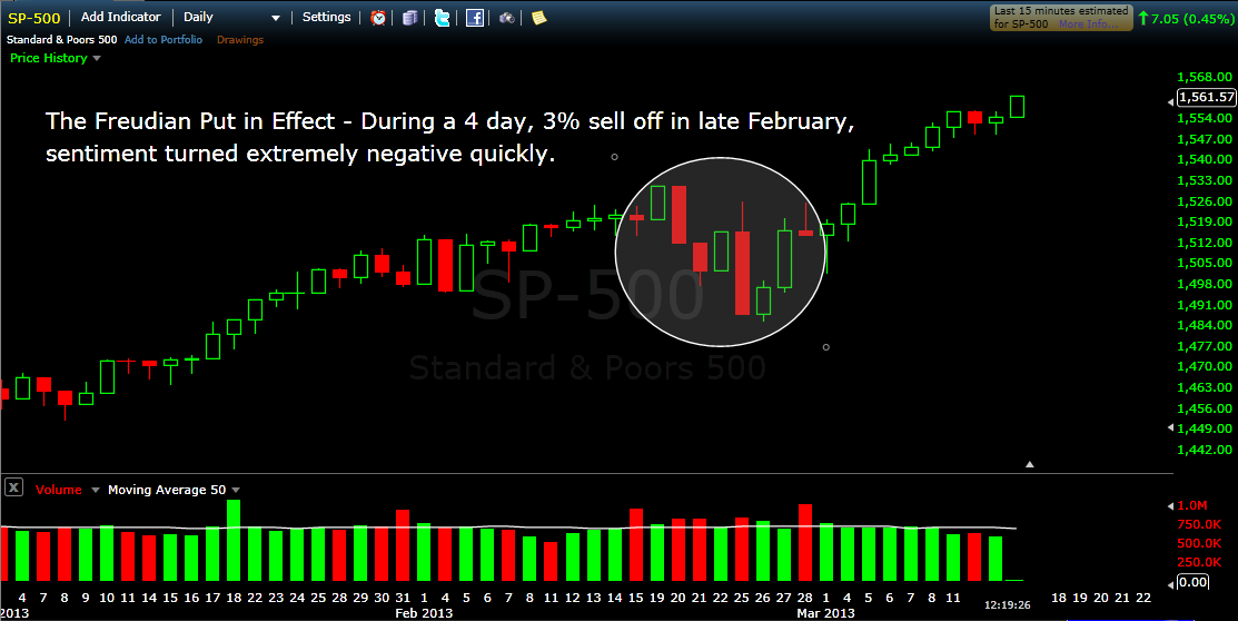
The most recent example of The Freudian Put in effect comes from examining the media/pundit reaction to the most recent pull back. On February 20th the SP 500 fell 19 points (1.25%) and another 9 points on February 21st.
Here’s some prominent examples of market press from February 21st all of which got huge play:
1. GARTMAN: We Are Exiting All Bullish Positions and Rushing to the Sidelines – Gartman’s apocolyptic comments about “tectonic plates” and “earthquakes” got gobbled up like stuffing. via TBI
2. Doug Kass: ‘I’m As Bearish As I’ve Been In Some Time’ – Kass, who usually dances to the beat of his own drummer also seems like he was affected by the Fed minutes and relatively big down day. via WSJ
3. Marc Faber Warns: ‘Market Has Peaked Out’ – The media used to trot out Faber only at market extremes but now he gets play on two days of selling. via CNBC.

Yup, February 21st was a bearish media tsunami off one pull back that is now looking like a blip.
This is sentiment reactivity. This is The Freudian Put.
Now you will know what to look for to see if the Freudian Put remains in effect when the market turns lower for a day or a week or, perhaps, 40 trading days which was the approximate time span of both of 2012’s 2 corrections. Sentiment indicators will gap negative, the media will press fear and your aunt Ika will call you and ask nervously if you should be out of the market.

Commonly, when sentiment gets extreme, its pretty straight forward, simple even. We get something like diagnoses A & B below:
Diagnosis A: Bearish Simplex – Market gets killed, everyone gets negative and scared.
We are all fearful of losses and so extreme consensus bearish sentiment can be harrowing and we use words like panic to describe. Usually, we can also observe reflections of consensus bearishness in the reading of several indicators including the put/call ratio, the $VIX and the AAII Seniment Survey which I highlighted last week.
Diagnosis B: Bullish Simplex – Market rallies over a sustained period, most get positive and discount risk.
Generally, we just love the bull market. People’s moods improve, we buy stuff, companies hire and even hemlines rise with the market. Meanwhile, the same indicators mentioned above flash progressively extreme bullish readings…
Diagnosis C: Conflicted Complex – Market rallies over a sustained period while most feel strongly mixed.
Sometimes, though, things can get much more complicated such that the market indicates strong mixed feelings. Think about it, we humans have big complex brains and we are capable of experiencing strong mixed feelings, well, so is the collective market.
We have this situation now where most are feeling emotions associated with a bull market but at the same time they feel as if some shoe will imminently drop as shoes have been dropping left and right for 14 years now.
You see it in headlines but can observe it most succinctly in the mixed messages of two indicators. The $VIX is making low after low, suggesting expectations of continued subdued volatility. Meanwhile, though, the AAII Sentiment Survey shows significantly lower than average bullishness and higher than average bearishness.
This Diagnosis C is less common than A & B and so even experienced traders, who have learned to read market sentiment and adapt to their own, have some confusion here.
I am watching for fast changes in the extremes as a market tell. For ex: How quickly does the bullishness dissipate when the maket pulls back even a little? How much further in this rally until the bearish aspect of the complex diagnosis break down?
Despite the all time high this week on the Dow Jones Industrial Average, bearish sentiment actually rose 1.9% on the AAII Sentiment Survey to 38.5%, a full 8% above the long term average.
Bearish individual investors seem impervious to the new highs or the most recent 14.6% rally from $SPX 1353 on 11/15.
Extraordinary persistence.
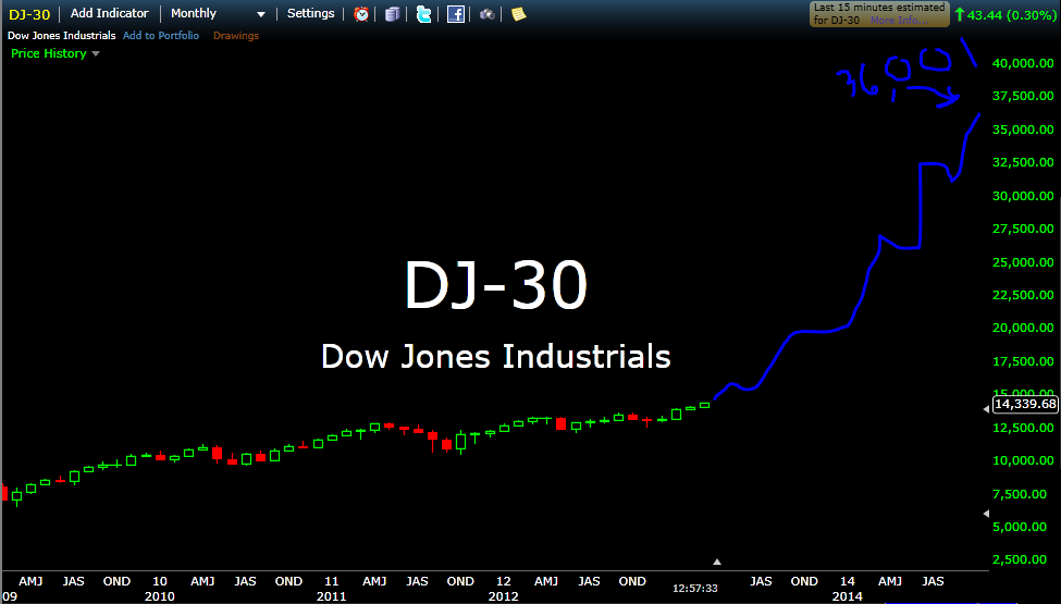
I read with interest this piece entitled Dow 36,000 Is Attainable Again.
With the Dow making new highs, Kevin Hassett, who wrote the book Dow 36,000 back in 1999, is back baby and it is all very exciting. (I kinda have a woody.)
Furthermore, I believe this forecast, while it might appear crazy after all we’ve been through in the new millenium, might actually be too conservative.
That’s right. I’m looking for 36,001. Here’s my analysis:

A quick note this morning about the new highs in the Dow and Transports.
These levels affect the way people think and there are reflexive aspects around corporate decision making and investor risk appetite especially if prices hold and markets continue higher over the course of the year.
Reflexivity, for those of you who are not familiar, is a concept applied to markets by George Soros, that describes the circular relationship between cause and effect.
Executives at large companies who observe the broad market making new highs and their own stocks doing well will have a tendency to grow more confident in the economy and their own businesses and confidence has been sorely lacking.
This, in turn, might lead them to be more aggressive in conducting business and, importantly, to do more hiring than they might have otherwise. More hiring would positively affect the economy, increasing consumer spending, confidence and the like.
We may also see reflexive investor behavior. The market goes up and people become more attracted to it as they observe others increasing their wealth. This, in turn, leads to more investors getting involved and further increases in equity prices.
These are only two data points in an incredibly complex environment but the potential reflexive aspects of new highs is worthy of mention.

I just got an email asking me this question:
Why are most people terrible investors?
This is one of many answers…
Most people are propelled by their own fears and fantasies while having no idea that this is the case.
Freud called it the iceberg (or topographical) model. 90% of the iceberg is underwater. Its his representation of the unconscious mind and the things that we are thinking or feeling that we are unaware of for whatever reason.
Not only are you unaware, but these undetermined experiences are guiding your behavior without you even knowing it, especially when the unconscious fear or fantasy is being triggered.
Sure, there is some variability there, and some people are more self aware than others, but for the most part its about 90%.
What’s more, even if you raise awareness and figure out that you are scared shitless of losing money because your distant ancestors, the ones whose genetic make up yours is a descendant of, lived in a highly resource scarce environment, one that you could not even envision, knowing that this is so and changing are two very different things.
Oh, One Other Thing – Beware People Telling You How To Cure Yourself of Being a Terrible Investor…
They have no idea what they are talking about.
Every time I read an article that explains why people are terrible investors (there are many reasons and my post only provides one angle), the social scientist or neuro-scientist or blogger/journalist reporting on the phenomenon snaps his finger at the end and tells you that now that he has explained to you why you are a terrible investor, you will be a much better investor.
This is ridiculous.
Here’s a quote from the Stanford Graduate School of Business Blog in an article titled Your Genes May Affect Your Financial Decisions that summarizes a study done linking genetic variation and risk taking.
“You’re not a slave to your genotype,” he said. “If you understand how it’s influencing your behavior, then you have a shot at changing that behavior.”
When I read this type of quote from the researcher, and they occur often, I find it so misguided that I have no choice but to question their research and how they contextualize their expertise back into the real world.
If you are genetically predisposed to having a food allergy, does your awareness of it cure you? No, it tells you to stay the fuck away from peanuts.
So, even awareness is overrated. Its a start but really its about your choices. Its where the training begins, not ends.
This morning, we highlight a few of the more interesting studies from the StockTwits Charts Stream.
1. You Can’t Paint to the Sky
Over the past several months, chartists have compared most everything in the universe to Apple ($AAPL) as its fall from grace has been spectactular and impossible to ignore. From Kimble superimposing the $AAPL chart with the Eiffel Tower back in November and closer to the beginning of the slide to more recent comparisons with the Gold Miners Index ($GDX) which is also getting shellacked.
Most recently, @Ryknow compared the $AAPL chart with Sherwin Williams ($SHW).
This one is interesting though, not for what it implies about $AAPL but because of what it implies about $SHW. It has been a hell of a run for the paint maker, a proxy for the recovering housing market, but as the slope of the rise increases towards parabolic levels, something must give.
2. Copper and the SP 500
Last week, I showed a copper chart and noted how the metal continues to act poorly even as the US equity indices approach all time highs.
Darren Miller (@psychtrader) posts an excellent comparison chart of the Sp 500 ($SPX) and Copper ($JJC) noting the divergence between the two.
Darren compares the current divergence with that of a similar one in 2006-2007. It should be noted from the comparison that the divergence can last quite a while and that the ’07 one resolved with a strong move to the downside for both.
3. Employing Value and Price
Despite much bickering between the schools, fundamental analysis and technical analysis can be employed in conjunction by investors who get the importance of each and plan well.
@Vlad_ggfinances does just that. He has been waiting to buy National Oil Varco ($NOV) based on value. Still, he uses technicals to help him determine an entry beforehand and to ensure that he gets the price he wants. He writes, “As soon as it gets to 60 I am buying been waiting for this.”
Love this patience, discipline and attention to price as value!
This afternoon, we highlight a few of the most interesting charts from the StockTwits stream.
1. Where’s the Volume?
Christmas usually marks the period of the year when trading volume is at its very lightest. This makes sense as most trading desks thin for the season and as company related news lightens significantly.
So it is interesting to note that as the SP500 made its recent high up at 1530, trading volume was incredibly light and comparable only to Christmas season volume.
@hertcapital’s chart posted earlier this afternoon displays the details:
It remains to be seen whether such anemic participation means that demand is finally drying up at these levels. That’s the implication for sure, though the 3 year year bull market manages to endure for the time being even as volume has been historically punk.
2. Apple Made (Another) New 52 Week Low Today
$AAPL closed down another 11$ (2.5%) to close the week at 430. This marks yet another 52 week low and its lowest close since January of 2012.
@Fibline’s weekly $AAPL chart puts the move from 705 to 430 in context showing just how little it has given up relative to its epic rally or, if you’re more the glass half empty type, how much more it has to fall. The bearish wedge (green dotted lines) is a nice touch.
3. Does The Market Have a Copper Top?
Can the global economy really recover and the US stock Market continue to climb without copper’s participation?
Earlier today, I posted this chart showing Copper ETN $JJC breaking its bullish trend line.
Copper is a key metal to watch because it is a proxy for industrial production and housing so to see it breaking down while US indices approach all time highs is, at the least, a divergence worth keeping an eye on.