This afternoon, we highlight a few of the most interesting charts from the StockTwits stream.
1. Where’s the Volume?
Christmas usually marks the period of the year when trading volume is at its very lightest. This makes sense as most trading desks thin for the season and as company related news lightens significantly.
So it is interesting to note that as the SP500 made its recent high up at 1530, trading volume was incredibly light and comparable only to Christmas season volume.
@hertcapital’s chart posted earlier this afternoon displays the details:
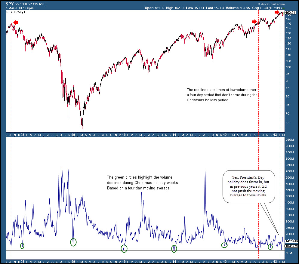
It remains to be seen whether such anemic participation means that demand is finally drying up at these levels. That’s the implication for sure, though the 3 year year bull market manages to endure for the time being even as volume has been historically punk.
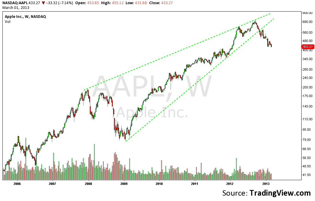
2. Apple Made (Another) New 52 Week Low Today
$AAPL closed down another 11$ (2.5%) to close the week at 430. This marks yet another 52 week low and its lowest close since January of 2012.
@Fibline’s weekly $AAPL chart puts the move from 705 to 430 in context showing just how little it has given up relative to its epic rally or, if you’re more the glass half empty type, how much more it has to fall. The bearish wedge (green dotted lines) is a nice touch.
3. Does The Market Have a Copper Top?
Can the global economy really recover and the US stock Market continue to climb without copper’s participation?
Earlier today, I posted this chart showing Copper ETN $JJC breaking its bullish trend line.
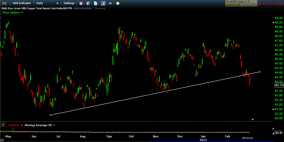
Copper is a key metal to watch because it is a proxy for industrial production and housing so to see it breaking down while US indices approach all time highs is, at the least, a divergence worth keeping an eye on.
Leave a Reply