Renaissance Capital provides a ton of great information relating to the IPO market in the US and globally.
As Linkedin begins trading today, its a perfect time to take a look and see if there is anything we might glean as the IPO market is often associated with the health of markets in general and more specifically the demand for equities.
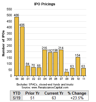
First, IPO’s have increased thus far this year over last year by 23% and, with Linkedin’s ($LNKD) offering today, will surpass all of 2009. The chart below provides perspective here not only of these past few years but also of the euphoria of the NASDAQ bubble as well as the dearth in 2008 and 2009 during the meat of the credit crisis.
Next, IPO pricings compared to range which provide, perhaps, the most direct glimpse at demand for shares in aggregate. Again, there’s a nice rebound from last year and a full recovery above the mean in the wake of 2008 which registered only 7% pricing above the range.
There’s an insidious theme bubbling up, especially on a day like today when the first large social media IPO is set, comparing the present period to that of the late 90’s into 2000. Observers were hugely affected by those events and so they loom in the psyche and flash lucidly to the forefront of recollection when events even remotely similar present themselves.
The data provided here though provides some perspective. While righting itself from credit crisis levels, the IPO market is nowhere near NASDAQ bubble levels.
Thanks again to Renaissance who provides this data and much more in well presented charts and graphs.


Leave a Reply